
Network for Applied Technology (NAT) Account Pages
My Role
UX Designer and de facto product contributor. I owned the wireframing, sketching, and Figma prototyping for the NAT member portal re-design. I collaborated with a Tech team lead, a second UX designer, and developers, and navigated a mid-project rebrand that required reworking the entire design system.
The Problem
NAT's existing member portal (natPortal) had layout issues — blank sections, text-heavy pages, and missing functionality that limited what members could actually do. As NAT grows its programs and community, the portal needed to be redesigned from the ground up: cleaner, more functional, and ready for new features that the current system couldn't support.
Navigating Ambiguity
This project had real constraints: mid-project team changes, a full rebrand, and some pages being paused due to shifting priorities across teams. Adapting to these without losing momentum is something I'd point to as one of the more useful things I practiced here — staying flexible without letting scope creep derail the deliverables that were locked.
What I'd Do Differently
The redesign was driven largely by internal team feedback rather than structured user research with NAT members. If I were leading this as a full PM engagement, I'd run discovery interviews with members before sketching — understanding what they actually try to do in the portal and where they get stuck would have given the design stronger grounding.
Skills Demonstrated
UX design · Figma · Wireframing · Prototyping · Design systems · Cross-functional collaboration · Adapting to ambiguity · Developer handoff
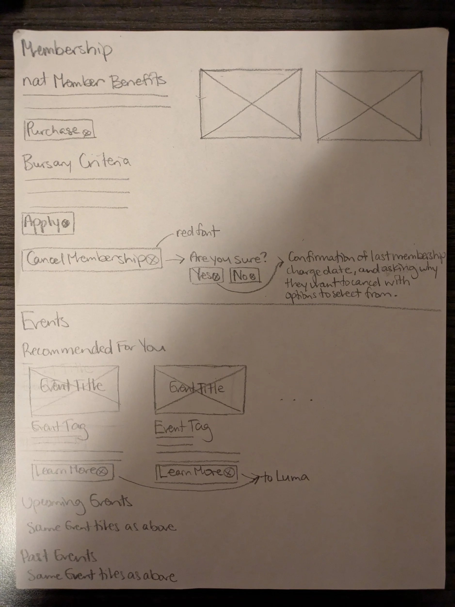
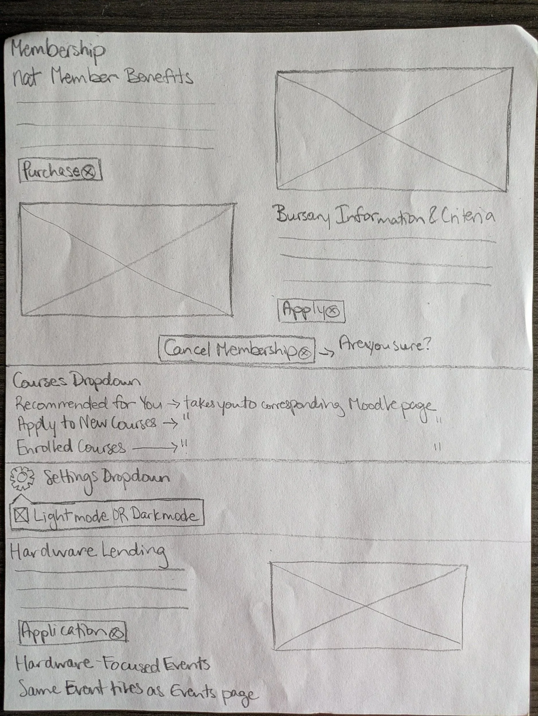
Step 1: Audit.
I reviewed the current natPortal when I joined in March 2025, identifying the key layout and usability gaps that would shape the redesign direction.


Step 2: Sketching.
I developed initial layout concepts through paper sketches, iterated based on feedback from the Tech team lead, and got sign-off before moving to Figma.

Step 3: Figma Prototypes.
I built medium-fidelity prototypes covering desktop and mobile layouts. Mid-project, a rebrand required me to update the sticker sheet, header fonts, and primary colour across all pages — a significant scope change that I worked through without delaying the team.


Step 4: Handoff to Development
The redesign has now entered its build phase, with developers using the Figma mockups to bring the new portal to life.